Data Visualisation CaseStudy
Contents
Introduction
The iMarine visualisation facilities will serve as an extension to the existing infrastructure, responsible for the visual presentation of large amounts of iMarine data stored or accessed by the infrastructure. Mainly, it will provide algorithms which given a set of well defined data, will produce a specific visualisation of them.
The main tasks of this component include the investigation for any data contained into or accessed by the iMarine infrastructure which can be visually represented and -subsequently- the creation of a variety of different types of visualisation for them. The visualisation facilities will be structured into two layers, one low level for the data manipulation in order to get them into a ready-to-visualise form, while the second will be responsible just for the visualisation.
However, most of the visualisation algorithms are currently not layer-based as described above, since they were just in a preliminary trial phase.
NKUA has started working on the visualisation of the iMarine datasets.Their work currently includes the visualisation of geospatial data of species' occurrences, in various different forms.
- has developed some visualisation prototypes
- expects partners to contribute by proposing changes or suggesting new visualisation types
Various visualisations of the species occurrences (location, magnitude, etc) have been created using javascript and java frameworks.
Datasets used:
The first step need to be done is to define what type of data needs to be visualised. That's a very basic step, since diffenent data types lead to different ways of visualisation. Currently, the datasets used for the visualisations are geospatial data of species observations over a time range.
- 75 observations of the species “Carcharodon Carcharias” within a 20 years time range,
- 128.500 observations of the species “Xiphias Gladius” within a 14 years time range.
- 1.790.560 worldwide observations of various species (source: FishBase - Royal Ontario Museum, Dept. of Zoology, Fish specimens observations)
Frameworks used:
The frameworks which are curently used to develop the visualisation prototypes are:
- OpenLayers library (javascript)
- Processing library (java/javascript)
- WorldWind library (java)
Due to the portablility and maintainance difficulties java-based visualisations introduced, it was decided to use only javascript frameworks for the visaulisations. All java-based prototypes described below will be replaced by similar javascript-based versions.
Visualisation Case Studies
Currently, three different categories have been identified for the current datasets:
a) Location based
In this category, the visualisation is mostly about presenting the location-related data on a map.
Use Cases:
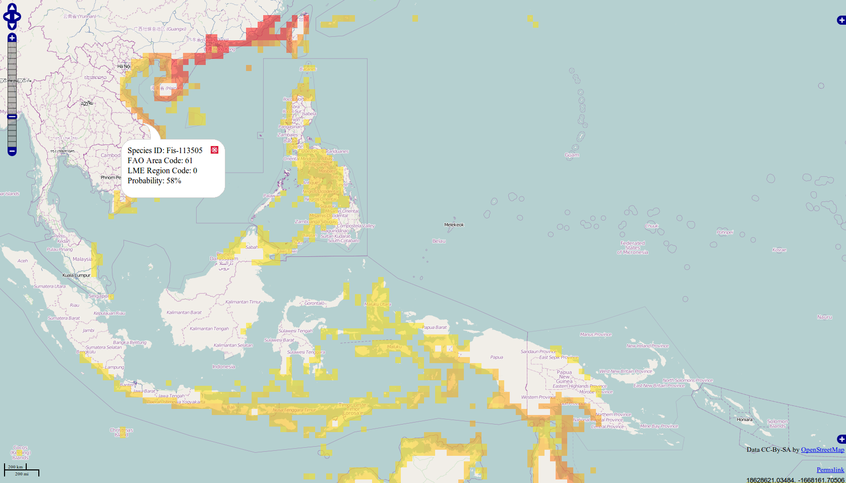
Species probability distribution
Description:
We visualise the probability that a species might exist in a specific area (c-squares)
Dataset used:
987 instances (species, c-square, probability) of a single species (scientific name: "Exerpes asper") over the Indo-Malayan and Austro-Malayan regions
Tools used:
the OpenLayers javascript framework
The above visualisation is a simple depiction of the geospatial data. We can generate better visualisations by using the time information which accompanies each species occurrence and by making them interactive.
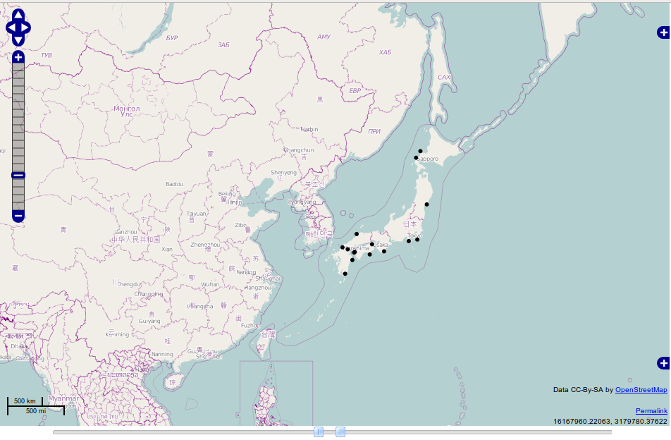
Species occurences with an interactive time filter
Description:
We visualise the places a species has been observed within a selected date range. An interactive double scrollbar filters the instances visualised, showing only the instances within the range.
Dataset used:
75 instances (c-square, observasion_date) of a single species (scientific name: "Carcharodon Carcharias") worldwide.
Tools used:
the OpenLayers javascript framework
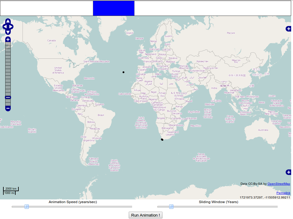
Species occurences with an animation
Description:
We visualise the places a species has been observed, through an animation. Species occurences over a sliding (time) window are shown. Both a visualisation time window (in years) and an animation speed parameter (in years/sec) need to be defined in order to run the visualisation.
Dataset used:
75 instances (c-square, observasion_date) of a single species (scientific name: "Carcharodon Carcharias") worldwide.
Tools used:
the OpenLayers javascript framework
b) Non-location, magnitude based:
In this category, we visualise data other than geospatial (e.g species population, species characteristics).
Use Cases:
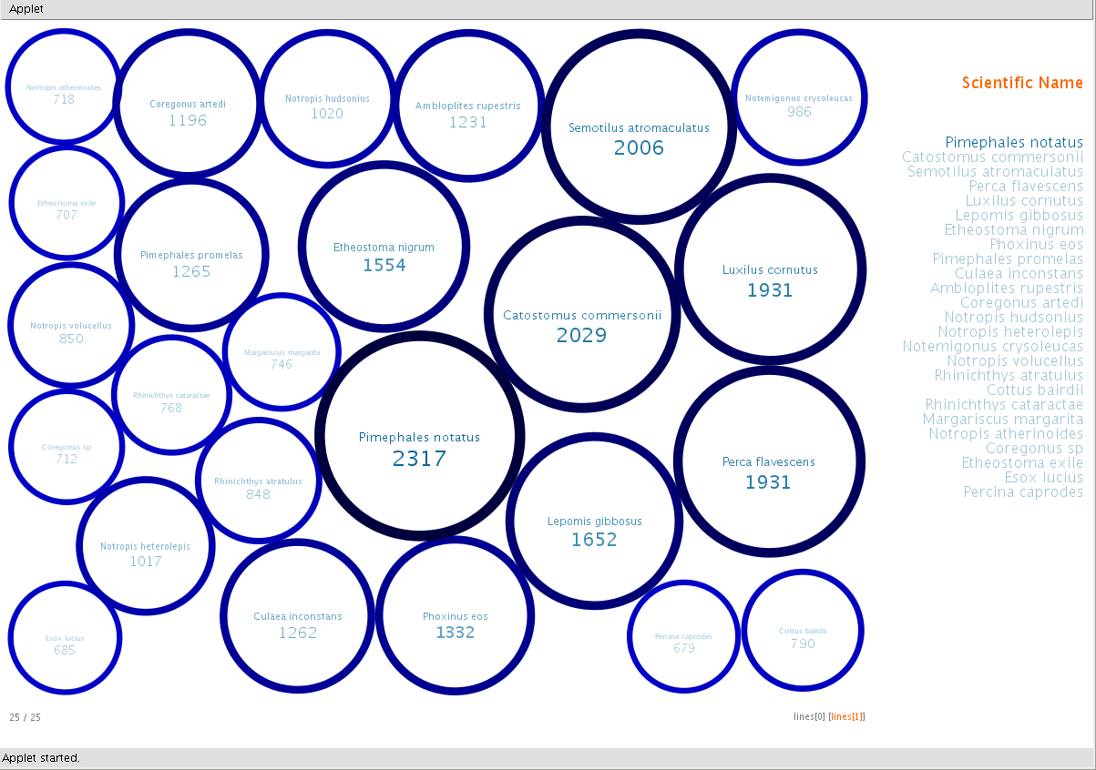
Species occurences in total
Description:
We visualise the total occurences of various species.
Dataset used:
total worldwide occurences (species, total#ofOccurences) of various species.
Tools used:
the “Processing” framework (Java)
Data source: Royal Ontario Museum, Dept. of Zoology.
c) Complex visualisations
A more sophisticated type of visualisation could be the visualisation of species relocations. This could be done by clustering the species data by their location (longitude, latitude) and time (observation date). Then, a probabilistic algorithm has to be applied on the clusters, in order to decide how the species have migrated.
Use Cases:
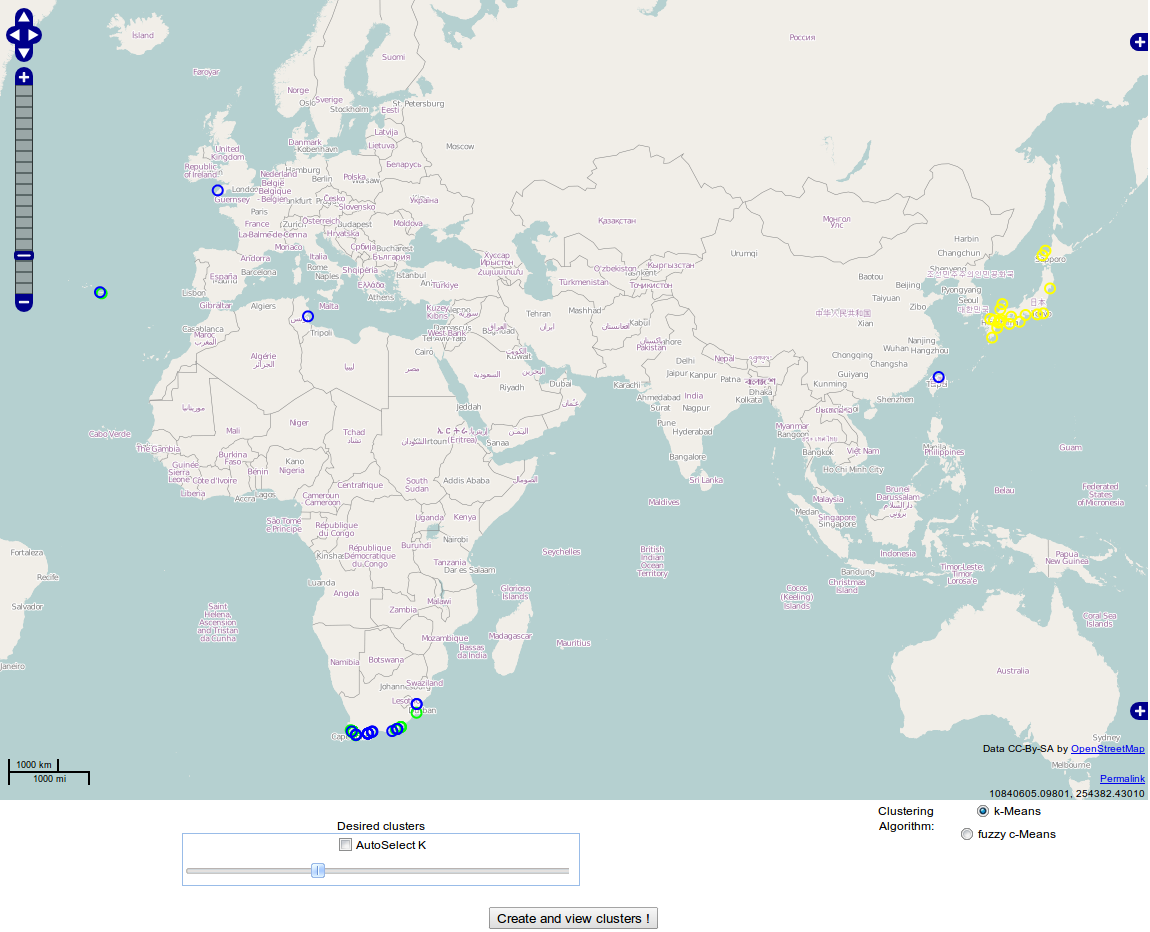
Species occurences grouped
Description:
We visualise the occurences of a species grouped by time and geolocation.
Dataset used:
75 instances (c-square, observasion_date) of a single species (scientific name: "Carcharodon Carcharias") worldwide.
Tools used:
the OpenLayers javascript framework
However, such a type of visualisation carries no useful information. What would be useful is to cluster instances within a time range (e.g. a year) and then try to discover how clusters of species have relocated.
Species migration
Description:
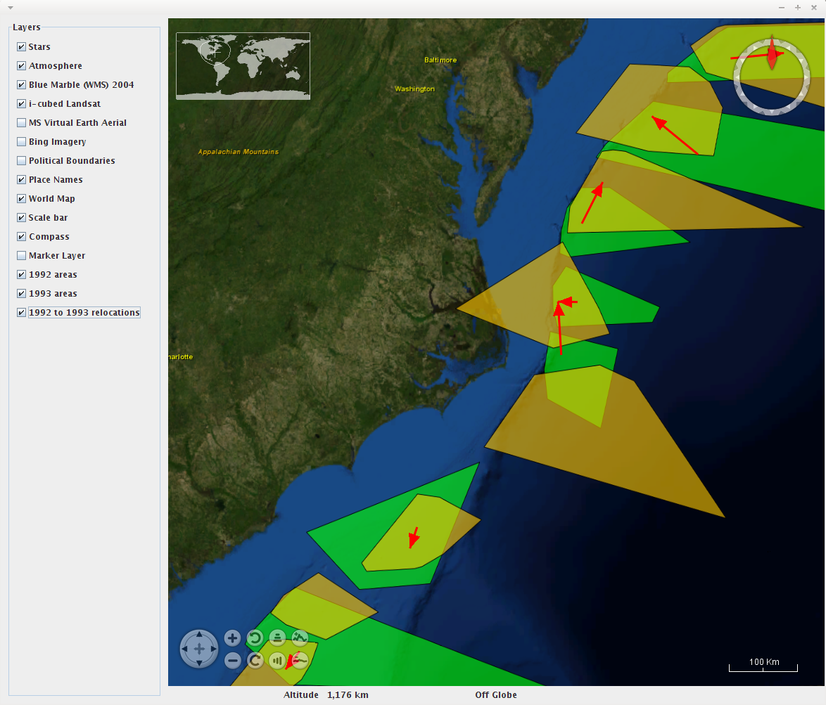
We visualise the clustered by time and location species occurences of two consecutive years. Then, we attempt to visualise the relocation of the clusters from one year to its following, using vectors.
Dataset used:
A couple of hundred instances randomly taken from a pool of 128.500 observations of a single species (scientific name: "Xiphias Gladius").
Tools used:
the WorldWind java framework (applet)
An outine of the logic used to create the visualisation shown below is:
- Bring a couple of hundred instances of Xiphias Gladius species from the database.
- Cluster all instances of 1992 into the theoretic optimal number of clusters according to their population, using x-means algorithm
- Cluster all instances of 1993 into the theoretic optimal number of clusters according to their population, using x-means algorithm
- Try to guess which clusters might have relocated from 1992 to 1993
- Visualise clusters (by creating a convex hull).
- Visualise clusters' relocations using vectors.
On the above visualisation, some improvements would be to:
- insert the information carried by the cluster instances' density – this could be done by scaling the color saturation by the cluster instances' density.
- use a smarter algorithm to guess relocations – currently, a naive distance-based algorithm is implemented.
- find a better way to visualise clusters rather than the convex hull of their instances.
Some issues that arose during the development of the visualisations:
- Javascript-based visualisations need significantly more memory to hold the same amount of data than other types of visualisation (e.g. applets). Furthermore, client side computations on javascript are notably slower than other implementations (e.g. applets).
- Java-based visualisations (applets) have significantly more dependencies,
- requiring a lot more data to be loaded (up to 20 times the data required for the javascript alternatives)
- are difficult to maintain
