Common Functionality
Describe the common functionality provided by any Community Web Portal for searching a collection, browsing the results, managing the content etc.
Contents
Search
Desribe the functionality commonly offered by the Search tab on GridSphere.
Basic Search
Combined Search
Collections Browsing
Result Browsing
Available functionality for browsing the search results
The Basket
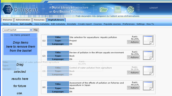
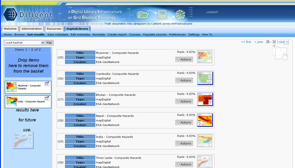
The Basket is thought as a personal user DL dependent area. The user can save its own preferred results by dragging them on it.
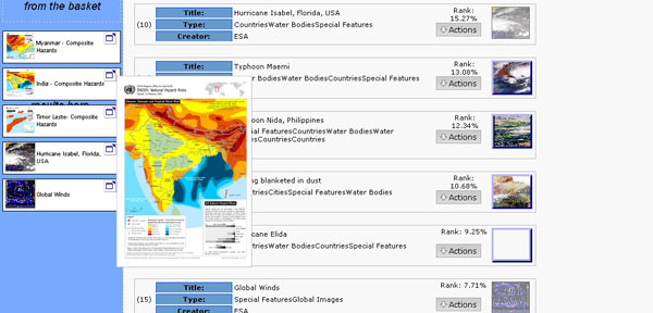
It is even possible to drag images in the basket (if they are retrieved results).
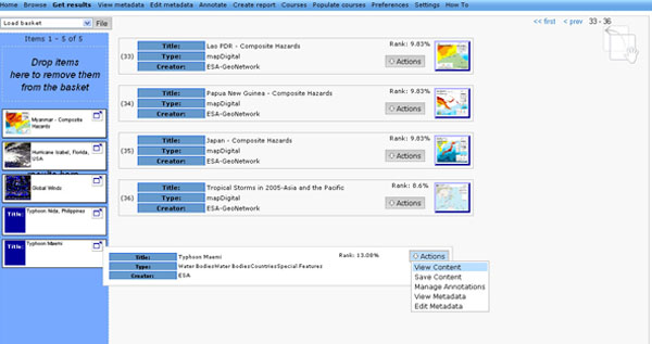
Indeed in the results page it is possible to drag whether records or images. The possibility is also thought for using them in the report generation and courses management.
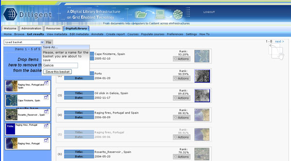
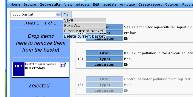
Once you have chosen your results you have the possibility to make them persistent by giving the basket a name and saving it on the server.
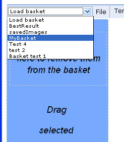
You can always load your saved basket using the dropdown list placed on the top of the Basket.
By accessing the File menu besides the dropdown list it is possible to save the basket, to clean it or delete it. Be aware that the delete command will phisically remove your saved basket from the server without any possibility to have it back.
Once you have your chosen items in the basket it is possible to access to all the actions you had in the results record page such as accessing metadata, add annotations, save or view the content. If the item is an image you can access to a small preview of it.
Common Browsing Activities
Annotations
Annotations’ management is performed by Annotation Front-End/ Portlet. This is a graphical user interface which provides an easy and sufficient way to annotate gCube resources. Annotation Front-End can be invoked by selecting to manage the annotations of an object in Results portlet.
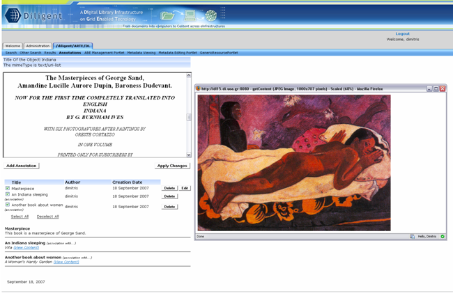
Then the user is moved to the generic annotation portlet where he is able to see the title, the mimetype, the content of the selected object as well as its generic annotations sorted by their creation date.
Depending on the mimetype of the annotated object the visualization of its content may differ. For the majority of the objects which are supported from browsers, the content is displayed in a specified part of the portlet. For zip files, its entries are displayed and the user is able to download it. Tiff images are transformed into a displayable format (png), video files are available only for download and the visualization of pdf files depends on the behaviour of the browser (normally a plug-in is required).
On the other hand, the annotations are shown up as a list where their title, the author’s user name and their creation/ modification date are posted up. The user is able to select which annotations (comments or associations) he wants to see just by clicking on the available checkboxes. The content of the annotations is shown below this list. In the case of associations, the title of the associated object as well as a link to its content is displayed.
The user may perform three operations. He can add an annotation by clicking on the “Add Annotation” button and afterwards by filling in the title and text field in the case of text annotations or by filling in the title field and selecting an object existing in basket as an associated object in the case of associations. He may also delete or edit an annotation.
If anchored annotations are supported for the annotated object the user can choose to be moved to the appropriate portlet by clicking on the “Go to anchored mode” button. Three portlets for anchored annotations are provided which are cover images, text and video files.
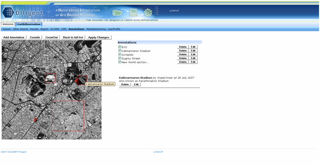
In image annotation portlet a user is able to add an annotation to a specific part of the image file. The user selects a space fragment which can be a rectangular area or a specific point (with a pin) and then he fills in the title and text fields. Then the space fragments are shown on the image and by clicking on one of them the content of the annotation is displayed.
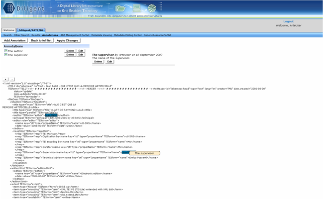
In text annotation portlet there is the capability of adding an annotation on a selected text fragment of the file. The selection of the text fragment is done in a very user friendly way as the user has only to choose the part of the text file with his mouse. The text fragments are shown with a different background in order to be distinguishable and by clicking on one of them the content of the annotation is displayed.
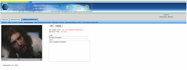
In video annotation portlet (still under construction) a user is able to select a time fragment which means a part of the video file that is defined by its starting and ending moment. Video annotation portlet has although some requirements as it needs Java Media Framework installed on the user’s computer.
Metadata Management
View and Edit metadata are the two functionalities that gCube offers to its users concerning the Metadata Management. These are described below.
Metadata Viewing
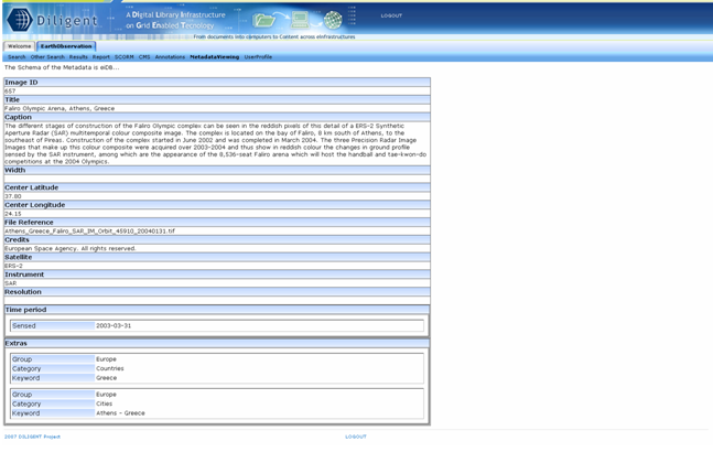
The Metadata Viewing Portlet is a graphical user interface that displays the metadata which are associated with a specific information object. This interface displays the object’s metadata in a graphical way which depends on their schema.
Furthermore the portlet provides the ability for each user to change the way the metadata are displayed. If a user wants to manage the layout of the metadata viewing portlet, he may choose one layout of the available. This selection can be done in the user profile editing portlet.
Metadata Editing
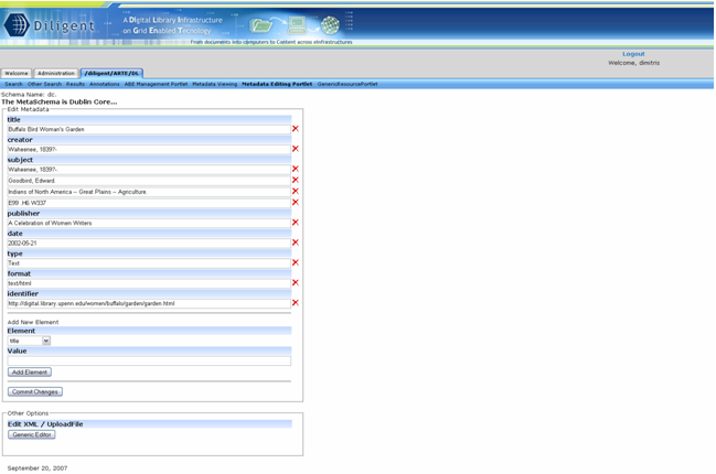
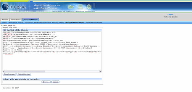
Metadata’s editing is performed by Metadata Editing Portlet. This is a graphical user interface which can be invoked by selecting to edit the metadata of an object in Results portlet. Depending on the schema of the metadata different editors can be displayed. There are two visual editors for dc and eiDB schemas and a generic one for the rest. However, for some collections, it is forbidden to change the metadata, something that is stated on screen with a relevant message.
The visual metadata editors provide an easy and user friendly way of editing the metadata. Adding, deleting and editing elements can be performed by clicking on the appropriate buttons and filling in text fields. When the user completes his desired changes, he has to apply the changes he has done by clicking on the “Save Changes” button.
The generic editor provides two options. The first one is to edit the bare xml in a text editor and the second one is to upload an xml file as metadata. However, these options require the user to have sufficient knowledge of XML.
User Profile Management
User Profile Editing
Profile Administration
Index Management
Full Text Index
After opening the the FullTextManagementPortlet, you will see a screen with an Index Explorer tree on the left side, and an (empty) Index Detail panel on the right. The IndexDetail Panel will be emty as no index resource is currently selected in the Index Explorer tree. The Index Explorer panel however, will always display one or more folder icons when the portlet is ready for use:
The folder icons represent metadata collections available in the VO. A big green folder (marked with a [1] above) represents a collection name which has one or more related indices. A big blue folder (marked [2]) represents a collection name which does not have any related indices. The single blue folder with a pencil above it and the text "Fake Collections" (marked [3]) is the only icon which is certain to be shown (even if no collections exist). This icon represents all collection IDs which are related to one or more indices, but which can not be mapped to a true metadata collections. This is a usual scenario when test indices are created without the need to be connected to a collection, or with a specific need not to be connected to a collection in order to not be used by the rest of the DL infrastructure.
A collection name is not necessarily unique, as many collections are allowed to have the same name though not the same ID. Actual metadata collections are represented by a smaller folder icon, along with its collection ID. Collections which have been indexed, are represented by a green folder (marked [4]), while collections which have not been indexed are represented by a grey foler (marked [5]).
Full Text Index Information
If you expand the green collection tree items (by clicking on the [+] besides them), one or more Index icons (marked [1] bellow) will reveal them selves. These represent Index Managers. If any Index Lookups are connected to the Index Manager, the Index item can be expanded to reveal one or more Index Lookup icons (marked[2]):
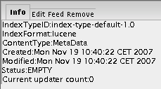
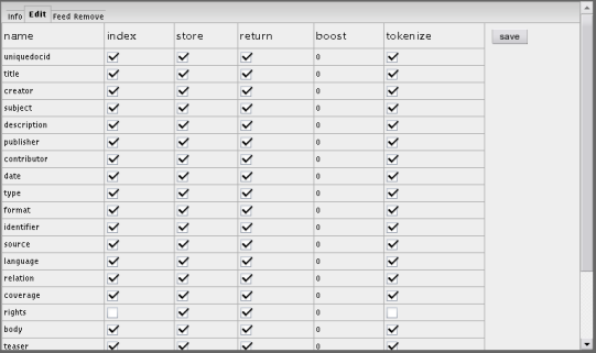
If you select either an Index item or an Index Lookup item in the Index Explorer, the Index Detail panel will show a tab panel with information related to the selected resource (WS ResourceProperty values). If an Index item is choosen, the IndexDetail will look similar to the following illustration:
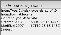
And if an Index Lookup item is chose, it will look similar to the following:
Editing the IndexType
In order to edit the Index Type of an Index Manager, make sure the correct Index item is selected in the Index Explorer, and select the "Edit" tab in the Index Detail tab panel. This will reveal Index Edit panel:
The chosen Index items IndexType is displayed as a list of Index Type Fields with editable checkboxes. The save button will save the IndexType currently shown to the selected Index Management resource.
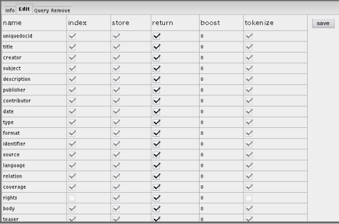
If a Index Lookup item was selected, choosing the "Edit" tab will reveal the Index Lookup Edit panel:
This panel is identical to the Index Edit panel, however only the "Return" checkboxes are enabled. This is due to the fact that the Return Element is the only part of an IndexLookup's index type which is editable. Any other changes will have to be performed towards the Index Management (using the Index Edit panel)
Creating a Full Text Index
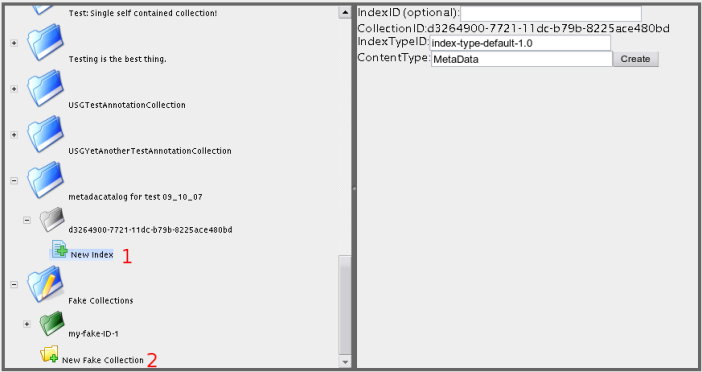
Creating a new Index can be accomplished by either selecting the "New Index" item (marked [1] bellow) or the "New Fake Collection" item (marked [2])in the Index Explorer:
Upon selecting one of the two said items, the Index Detail panel will allow you to specify the properties of the new Index. The IndexID property textbox should usually be left empty, in which case the IndexService itself will create a unique ID for the Index. If the "New Fake Collection" item was chosen, you will also need to specify a collection ID (fake - "myTestCollection1" or something to that effect), however if the "New Index" item was chosen, the collection ID will be retrieved from the parent collection item and will not be editable (as shown in the image above).
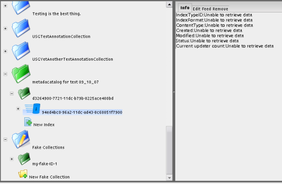
After specifying the properties of the new Index, push the "Create" button in order to create the new Index. Upon success, the new Index Item will appear and be selected in the Index Explorer. The "Info" tab of the new Index will be shown in the Index Detail panel:
Usually (and as shown in the above image), the Index Detail panel will be unable to retrieve information about the newly created Index. This is due to the fact that there is a slight lag between the creation of an Index and the availability of information about the Index. Selecting the newly created Index item once more (by clicking on it) will update the Index Detail panel with valid data.
Creating a Full Text Index Lookup
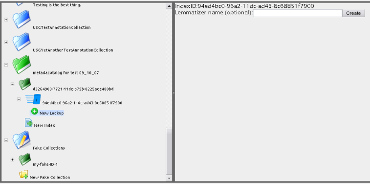
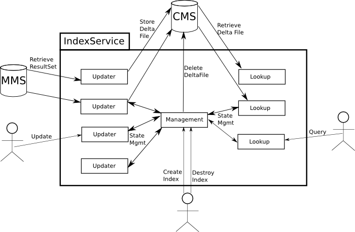
In order to query an Index, an Index Lookup resource is needed. An Index Lookup can be created at any point in the life time of an Index, and will automatically be updated when new information is indexed by its Index Manager. In order to create a new Index Lookup resource for an Index, select the "New Lookup" item under the Index item in the Index Explorer:
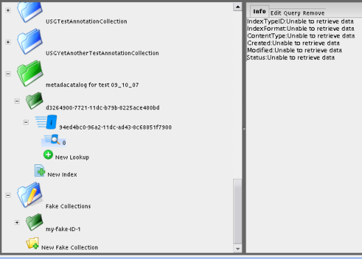
The Index Detail panel will show a very simple interface, allowing you to specify the Lemmatizer plugin the new Index Lookup should use. Usually, this text box should be left empty, in which case the default Lemmatizer plugin will be used. Pushing the "Create" button will trigger the creation of the new Index Lookup. Upon success, an item with a new icon will appear and be selected in the Index Explorer. This item represents the newly created Index Lookup. The "Info" tab of theIndex Lookup will be shown in the Index Detail panel:
As with the creation of an Index, the Index Detail will usually not be able to get information about the Index Lookup right after its creation, in which case you will have to select the Lookup item once more if you need to see valid information about the new item.
Feeding a Full Text Index
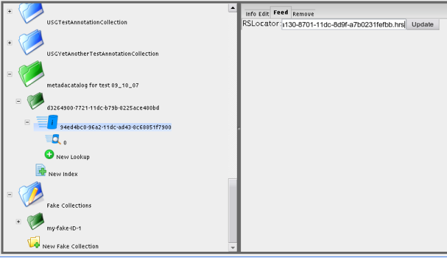
The information to be indexed is fed to the Index through a ResultSet. In order to index the ResultSet, select the Index item to use in the Index Explorer, and choose the "Feed" tab. Enter a valid RSLocator string in the textbox as shown bellow (the RSLocator string in the example is a bit strange since points to a local ResultSet):
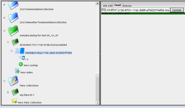
Push the "Update" button to start the indexing of the provided ResultSet. A green label will indicate that the update has been successfully started:
Testing/Querying a Full Text Index
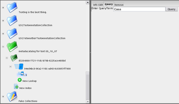
In order to test (by querying) an Index, an Index Lookup for the Index in question is needed. If one is not available, it has to be created. If an Index Lookup is available for the Index to be queried, select the Index Lookup in the Index Explorer and select the "Query" tab in the Index Detail panel. This tab allows you to enter a query string as shown bellow:
Pushing the Query button will perform a query against the Index Lookup. Upon success, the first page of the results of the query will be shown in its raw XML format bellow the query text box:
Removing a Full Text Index or Index Lookup
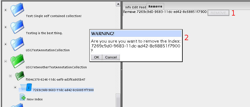
In order to remove an Index or an Index Lookup, select the item to be removed in the Index Explorer and choose the "Remove" tab in the Index Detail. Clicking the remove button (marked [1] bellow), will cause a warning dialog (marked [2]) to be shown. Push the "OK" button to remove the resource (and keep in mind that removing an Index resource will automatically remove all Index Lookup and Index Updater resources connected to it):
Upon success, a green confirmation message will be shown:
Upon failure, a red error message will be shown. This messge is usually due to the resource already having been removed, but still being present in the Index Explorer due to delays in the underlying infrastructure.
Geo Index
Overview
Geo Index Information
Editing the GeoIndexType
Creating a Geo Index
Testing a Geo Index
Removing a Geo Index
VRE Monitoring
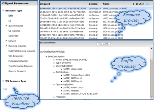
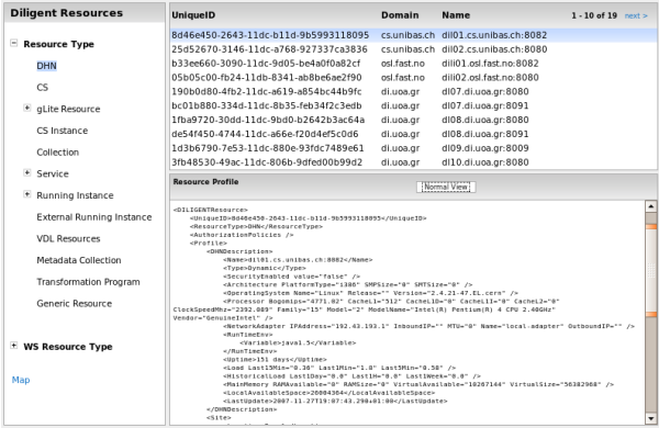
The monitoring allows to control the status of infrastructure for the VRE.
On the left panel the user has the opportunity to choose which type of resource he wants to monitor.
On the upper-right panel the user can navigate the list of the resources of the type selected of the left panel.
The profile of the selected resource in the list is shown in the down right panel. By default the profile is shown in an user oriented view. Clicking on the button "XML View" the profile is shown in XML mode. Newly clicking on "Normal View" the profile is shown in an user oriented view.
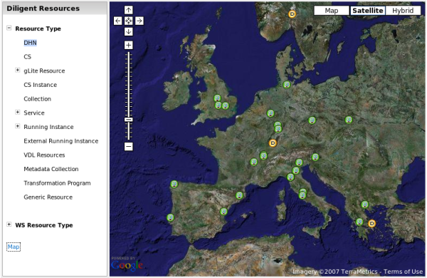
Selecting "Map" on the left panel the location Map of the hardware resources are shown.
The green icons ![]() represent gLite Nodes, instead the yellow icons
represent gLite Nodes, instead the yellow icons ![]() represent DHN.
represent DHN.
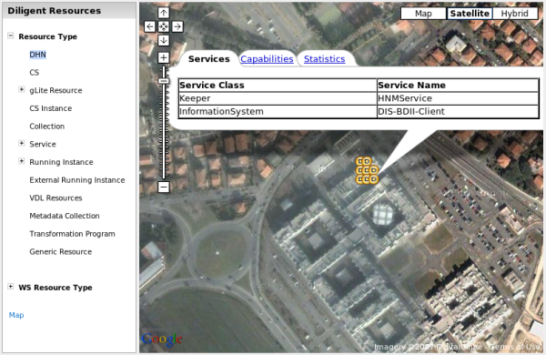
Clicking on the icon a zoom is performed if needed and a Tabbed Information Window is open. Each tab represents a part of the information available for the selected node. In some cases in the Tab Information Window there are some links which cause the opening of a new browser window.
VRE Management
Resources Registration
It is possible to register various types of resource on infrastructure. There is a dedicated user interface for each of them. After the registration process, each resource is going on a pending state and needs to be approved by one administrator with the approval user interface.
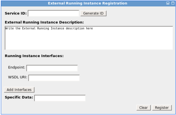
External Running Instance Registration
An External Running Instance is a WEB-Service which we want to make available in the infrastructure.
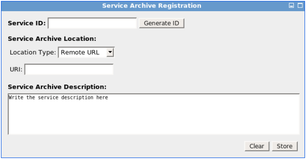
Service Archive Registration
A Service Archive is a software component compliant with gCube policies we want to register in the infrastructure.
DHN Registration
A DHN is a Server empowered by the DHN software component.
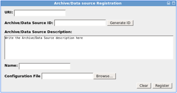
Archive/Data source Registration
Any existing data sources can be made available in the infrastructure defining the appropriate configuration file. The syntax of the configuration file is described in the Archive Import service documentation.
Resources Approval
For each kind of resource the user can register, the approving step need to be performed by one administrator. After this step the resource are available on the infrastructure.
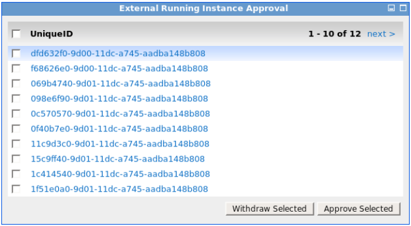
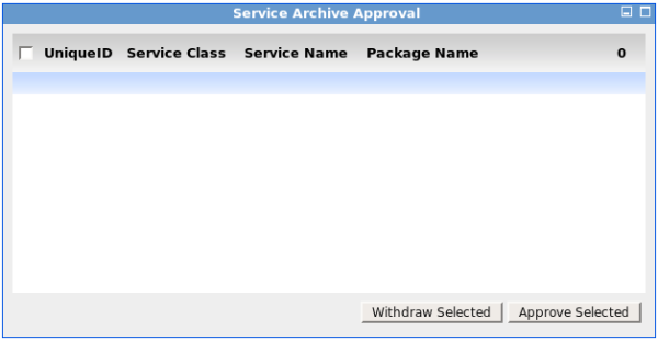
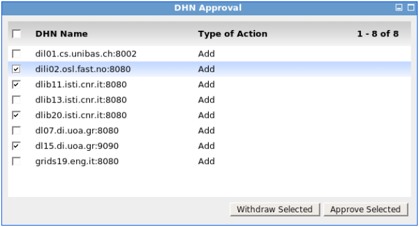
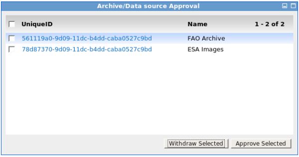
All this portlets are list with a checkbox on each row. After the selection process the administrator has the opportunity to choose the action he want to do. Two actions are possible: Approve or Withdraw. This is performed on the selected resources by clicking on the relative button. The list is paginated and present 10 resource for each page. The action has affect only on the selected resources on the current page.
External Running Instance Approval
Service Archive Approval
DHN Approval
Archive/Data source Approval
Services Deployment
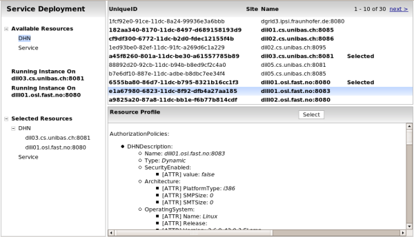
This task is available with an user interface looks like the monitoring. Apart a reduced the monitoring issue the administrator can select the DHN and the Services he wants to deploy on the nodes. For the DHN only, the one in bold in the list can be selected. This due to configuration of the DHN made by the administrator, for example in respect of the institution policy or others reason. All Services can be selected.
The selection/deselection of one DHN or Service can be done using the button on the header of the bottom-right panel. When a Node or a Service is selected, it is inserted on the "Selected Resource Tree". These tree can be browsed as the "Available Resource Tree". These allow the user to have a sort of basket to check the selected resources in each moment.
Further, when a DHN is selected another entry is presented on the left panel. In particular it is present Running Instance On <Name of Selected DHN> entry. Clicking on it, the upper-right panel lists the already available Running Instance on that DHN. This allows the administrator to evaluate a DHN. For example, the administrator can decide if the selected DHN is the proper one to host new Service[s] deployment.
When at least one DHN and one Service are selected a Deploy button appears on the left panel.
Clicking on it the deploy process starts after a confirmation request.
During the deployment is presented a Dialog Box with the deployment status. The status is refreshed until the process is completed with a failure or with a success.
VRE Creation
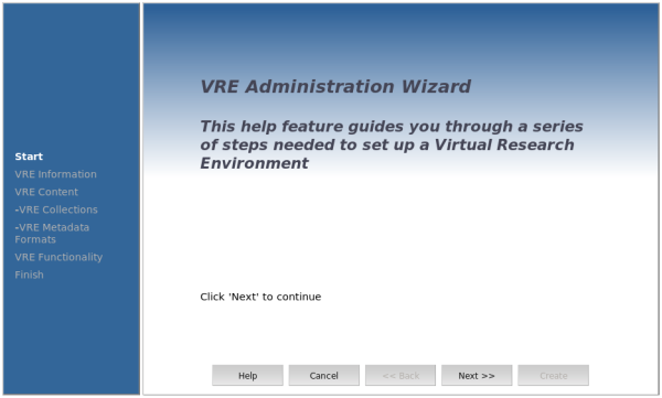
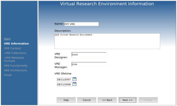
Wizard mechanism is the way used to create a new VRE.
The wizard is composed by 4 step at design time.
- VRE Information
- VRE Content
  - VRE Collections
  - VRE Metadata Format
- VRE Functionality
When the Administrator will approve the VRE, he will be able to see and modify each step. Further, he will do an additional step VRE Architecture.
